How We Conduct User Testing and User Interviews
Usually "Informal" User Testing is the Best ROI
Too often "user-testing" can mean a months-long process that only creates reams of documentation that go unread. We typically focus on getting the highest-value results as quickly as possible. Our staff is trained in methods of identifying target customers, segmenting them, and then building understanding of how to optimally design for those target groups. We do this in a way that balances the need to move fast with the rigor and balance of an unbiased experiment.
 We work with our clients to develop an understanding of the target market, and then challenge those assumptions to create a nuanced view of the target customer. Then we'll identify ways to quickly reach people in those markets (including Facebook ads, attending industry meetups, finding enthusiasts on Instagram, and more) and schedule a series of interviews with those users (in the office or at a coffee shop), which are recorded, transcribed, and mined for insights.
Once a prototype has been developed, we'll sit down with additional users in the target areas to gauge the usability of the prototype and ensure that it's meeting their needs. In our experience, no other methodology works as quickly to ensure that we're building products to delight customers.
If Needed - Formal Usability Testing in a Lab
In these cases, we handle the entire project “turn-key,” including recruiting and compensating the participants, preparing the testing facility, and reporting the results. We expect the following work will be required, in ongoing collaboration with the client:
- Kickoff / Assessments
- Discuss top-level goals, what is good and bad about the existing product, areas for improvement, advantages / disadvantages, motivators, drawbacks, calls-to-action. Discuss hypotheses (e.g. “we think it breaks because of x”).
- Discuss metrics that might be available that suggest current product performance or areas for improvement.
- Discuss demographic breakdowns (e.g. lean more towards customers that are shopping for more expensive items or just an “across the board” type of customer sample).
- Develop a screener that successfully selects for the right participants from the general population. Attempt to screen for certain recent qualifying activities related to the task (i.e. visited a competitors web site, purchased books on the subject, etc.).

- Recruit participants from the general population. Recruit “floater” participants to be available as-needed in the case of no-shows or disqualified participants. Compensate the participants.
- Develop test materials including the moderator guide. Handle the multiple ways and platforms in which the product should be tested (e.g. mobile, web, tablet, etc.).
- Run the usability testing and handle the testing logistics.
- Prepare the testing facility, prepare the technology (including video recording and live stream if necessary), prepare the observation room with large screen, and prepare all of the devices that are to be tested.
- Expect several days at the usability testing lab.
- Testing conducted by UX Researchers under the supervision of our Engagement Manager. Detailed logging and note taking.
- Some participation by client, e.g. two to five people in attendance per day observing the testing in progress. Parking and meals to be provided.
- Conduct analysis and report testing results. Review and crunch the resulting data. Report on the results, issues, and recommendations in an actionable presentation format.
Expectations are Changing; UI Designers and UX Designers Take Note
In recent years, the massive shift towards web apps and mobile apps have completely changed user expectations around how software should look and work.
When most folks are using the computer, they’re on the web (and increasingly not in a Windows app, except, of course, for the web browser that they’re using to access the web) and at these web sites:
[cols]
[col class="1/4"]
Google
Facebook
YouTube
[/col]
[col class="1/4"]
Yahoo
eBay
Amazon
[/col]
[col class="1/4"]
MSN
Pinterest
Hotmail
[/col]
[col class="1/4 last"]
Bing
Wikipedia
Twitter
[/col]
[/cols]
And, these same folks have a smartphone and are using these apps:
![]()
Users are expecting apps to be simpler, dynamic, “active” or “alive,” personalized, and responsive:
- “3 days ago”; relative date/time formatting
- Content first; labels and other items demoted
- Mixed Case vs. all UPPERCASE; natural and easier to read
- Hierarchy represented with whitespace and lines vs. rectangles within rectangles
- Minimal horizontal scrolling
- Modal; focus on one thing at a time
- Beautiful and actionable dashboards
- Progressive disclosure (show stuff as-needed)
What does this mean for the user experience design of your enterprise applications?

For Inspiration: Uncover Invisible Motion in Video
Here's one of those simple ideas that can yield incredibly useful results.
Take a video of something (like a baby sleeping), take notice of the tiny little changes that are barely visible (to the human eye), and amplify those changes.
WOW - a stunning visualization technique that could enable a person to see things with the naked eye that were previously invisible.
This NYTimes article (and must-see video) is incredible and inspiring.
We've seen the technique used by Philips Medical in their iPhone app: by taking a short video of your face (or someone elses of course), it can detect the heart rate.
Imagine this used with Google Glass when playing poker (what would an elevated heart rate reveal!?)

User Interface Designers: Create Crude Prototypes in 15 Minutes
PopApp is a really simple tool, for iPhone and Android, that lets you:
- Draw-out your idea for an app
- Take photos of those drawings, and
- Stitch them together.
The result is a crude prototype and lets you see and feel how your app might look and work.
We use it often (with final screens that our mobile designer has created in Photoshop) in user testing: before we write a single line of code, get a sense of how users might interact with the app, what they might find confusing, etc.
User Experience Consultant
Looking for a User Experience Consultant? We'll transform your ideas into concrete product designs. We'll help you develop your product strategy, create detailed prototypes, and more. See iterationgroup.com
Use These Mockups: Lots of Design Patterns in Balsamiq Mockups (BMML) format
For those of you that use Balsamiq Mockups, here are a bunch of templates I created that you might find handy.
Download them all in one ZIP file (90KB).
I find myself re-using many of these elements when I design applications (especially the boring/tedious/must-have features, like Forgot Password, Sign In, 404 page). Enjoy!
The following mockups are included in the ZIP file:
Home Pages
 |
| Home Page, Members Only Mockup |
 |
| Home Page, Downloadable Product Mockup |
Feature Tour
 |
| Feature Tour Mockup |
Pricing, Upgrade, Downgrade
 |
| Pricing Page Mockup |
 |
| Upgrade & Downgrade Mockup |
 |
| Upgrade "Thank You" E-mail Mockup |
Read-Only List of Items
 |
| Read Only List of Items Mockup |
Editable List of Items
 |
| Editable List of Items Mockup |
 |
| Add Item Mockup |
 |
| Edit Item and Delete Item Mockup |
Invite Friends
 |
| Invite Friends Mockup |
 |
| Invite Friends Via E-mail Mockup (Popup) |
Settings / My Account Page
 |
| Settings / My Account Page Mockup |
Sign In
 |
| Sign In Page Mockup |
 |
| Sign In Popup Mockup |
Forgot Password Process
 |
| Forgot Password Page Mockup |
 |
| Password Reset Email Mockup |
 |
| Reset Password Page Mockup |
Miscellaneous
 |
| 404 Page Mockup |
 |
| Log / History Page Mockup |
 |
| Downloading Page Mockup |
 |
| Windows System Tray Mockup |
 |
| Windows Tour Mockup |
Few Firefox 4 UI Complaints
Like most of the planet, today I downloaded Firefox 4 to check it out. I've been a happy Chrome user for a while now (and before that, Firefox).
Upon first glance, I've got a handful of UI complaints. Things that could obviously and easily be improved, I think.

- The "Title Button". Why orange? Why so prominent? Why so high-contrast?
- Clicking The "Title Button". Ohh my. This is a UI abomination. OK, maybe it's not that bad, but it's really bad. The groupings are unclear. Why two columns? What is the difference between items in the left column and the right column? "New Tab" has an arrow indicating that mousing-over it will reveal more stuff...or, is it pointing to the right column? Edit is italicized for fun! The Cut icon (scissors) has to be the worst Cut icon I've ever seen. Almost doesn't look like scissors! The Print icon...

- The Tabs. I see now that Chrome has spoiled me with a really nice tab design. These Firefox 4 tabs are so blocky. The vertical lines separating the tabs are too bold. The fact that both sides of each tab intersect with the horizontal line beneath them is too harsh. Chrome, by contrast, has a neat curved tab design, where only one side of the tab (except for the leftmost tab) intersects with the line.
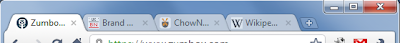
Chrome Tabs: Nice

Firefox 4 Tabs: Ugly

Microsoft Word's tab design, for instance, shows an interesting way to improve upon Firefox 4: by hiding the border of the not-in-focus tabs. I guess this might not work well in Firefox, given the design of the Bookmarks bar. - The Buttons and General "3d-ness". The Home Button. The Bookmarks Button. The Firebug button (if you use this addon). They're light up-top, dark towards bottom. Have a slight shadow. Rounded corners. They look nice, but these details just aren't necessary. Too many lines. Accentuates the whitespace (the area in between buttons) too much. Again, see Chrome for contrast (apparently even theChrome logo is going flat)
Aza, where were you!?